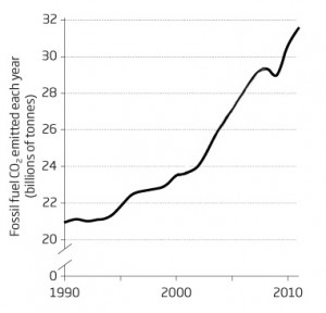
 This is a graph showing global CO2 emissions from fossil fuels over the years 1990-2011 (published in last week’s New Scientist). The curve shows a meandering upwards over the course of the ’90s, gathering in force and momentum along the way, and really carving a groove up through the last decade. Around 2008 there was a small hiccup following the financial crisis, but otherwise, the story is largely one of not only rising emissions, but of rising rates of rising emissions. Which is funny, because all this time, the talk — and in ever increasing volumes — has been about reducing emissions.
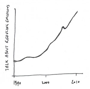
The term “global warming” was first coined in the ’70s, though it didn’t start to get popular until the early ’90s, when it embarked upon an exponential of its own. With science and worldwide concern mounting, the first Kyoto Protocol was held in 1997 (which took 1990 as the benchmark for future emissions assessments — symbolically establishing this as the year when humanity started to get serious about things). Since then of course, there has been more Kyoto, as well as Copenhagen, Doha, the Stern report, not to mention annual global talks sponsored by the UN, semi-continuous EU sessions, country by country enquiries, targets and resolutions, and countless conferences among myriad industries. Accompanying all this has been the ever ecstatic media, by turns: forecasting environmental armageddon; dispensing cool inconvenient truths; and offering hopeful-helpful tips on home wind turbines, and how to grow your own tomatoes. Naturally these have come with products galore, sensitive biobrands, options for green lifestyle choices, and innumerable favourite conversations among the environmentally switched-on. It’s hard to put all this into simple units of data, but here is a concept graph showing global talking about CO2 emissions over the years 1990-2011. It demonstrates a similar general mounting of intensity, again with the blip in 2008 as everyone flipped to talking about banks, before the bank talk started to incorporate visions of how to use the crisis to reinvent the global economy as a newer, fairer, greener and less-emitting beast.
Thinking about these two graphs, I was reminded of another graph I saw not so long ago showing the size of the Brazilian Amazon over the years 1970-2008. Here we see a relatively steady progressive destruction – increasing in pace a little around the start of the ’80s, and then settling to a whack-rate of around 20,000 km2/year. Again the data I have on talk derives less from satellite measurements than from research-by-feel techniques, but again, the concept graph shows a neat mirroring with what is actually happening on the ground. As with the rising emissions / talk about reducing emissions scenario, we see the diminishing forest cover matched by roughly equal levels of year-on-year talk of preserving it. The talk-curve shows the slow-starting of the save-the-rainforests and save-the-Amazon memes in the ’70s, before they both found their feet in the ’80s, and kept to a firm climb ever since.
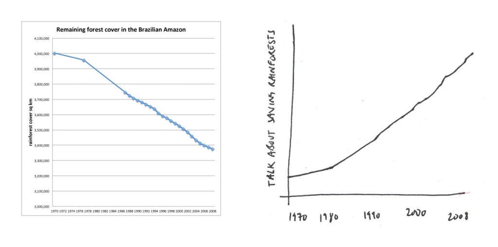
source data: (left) from Brazilian National Institute of Space Research (INPE) and the United Nations Food and Agriculture Organization (FAO), quoted http://rainforests.mongabay.com/amazon/deforestation_calculations.html; (right) research-by-feel
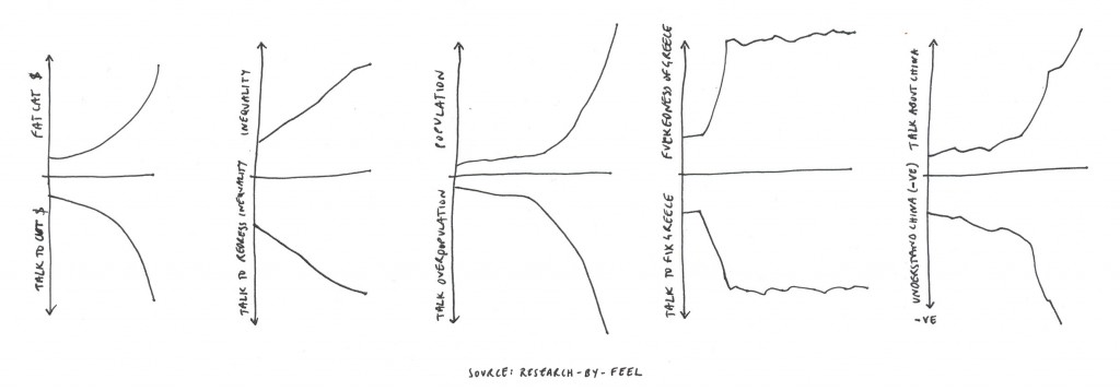
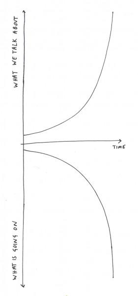
Both these examples relate to environmental issues, but I would argue that this “mirror effect”, by which what is happening in the world is reflected perfectly — only in reverse — by what the world is talking about, can be observed more widely. Here are a few other fields and opposing fact-talk graphs that come to mind:
1. Graph showing bankers’ and chief executives’ pay (shooting up) and talk about cutting bankers’ and chief executives’ pay (shooting up a reverse axis)
2. Graph showing global inequality (strong rise) and talk about efforts to redress global inequality (strong rise on a reverse axis)
3. Graph showing world population (shooting up) and talk about overpopulation (shooting up a reverse axis)
4. Graph showing how fucked Greece is (a big jag followed by a high and rocky line) and talk about fixing how fucked Greece is (a big jag followed by a high and rocky line on a reverse axis)
5. Graph showing talk about China (shooting up) and actual understanding of China (shooting down). N.B. In this I include the 1.3bn people in China (after all, you can’t realistically exclude them when considering levels of global talk), who, as much as people in the West, have been talking explosively more and more about China, while knowing less and less about what the hell is actually going on.
These examples relate mostly to global or socio-political concerns in a collective capacity, but is it not possible to think also about how mirror graphs may relate to the personal sphere? The development of personal understanding, and how much people talk about the thing in question, may produce similarly opposing curves. As might such pairs as talking and lovelife (in terms of sexual activity, fidelity etc.); talking and resisting a temptation of some kind (e.g. booze, cakes, smokes); talking and being fair or “exhibiting fairness”; and indeed talking, and valuing the quality of restraint from talking too much (especially in the case of spiritual people). It is easy to imagine how with all of these, talking and occurrence can show strong mirroring. Which leads to the suggestion of a more general and-all encompassing concept graph, showing the relationship between what we talk about, and what’s really going on. Or, put more Carverishly, what we talk about when we talk about anything.

Yes.